Monday, 22 August 2011

Romanticism Artwork

Romanticism is not about love, romance or valentine, but it is about self creation.
I found that romanticism paintings are realism and emotionalism.

"The Romantic movement promoted 'creative intuition and imagination' as the basis of all art."
 Reference : http://www.visual-arts-cork.com/history-of-art/romanticism.htm

_________________________________________________

These are some romanticism paintings which I learned today.

Retrieved August 22, 2011 from : http://img1.ranker.com/list_img/1/158487/full/romanticism-art-and-artwork.jpg?version=1312545710000
Retrieved August 22, from : http://www.lib-art.com/imgpainting/9/2/10429-the-raft-of-the-medusa-theodore-gericault.jpg
Retrieved August 22, from : http://studio.pds.wikispaces.net/file/view/David_-_Napoleon_Crossing_the_Alps.jpg
Retrieved from : http://www.lilithgallery.com/arthistory/romanticism/franciscogoya-MayThird1808.jpg

Sunday, 21 August 2011

Rembrandt van Rijin

Last 2 weeks,
Dr Ray asked us to draw Rembrandt van Rijin.

The pictures above is the comparison of the original pictures and my sketching.

Retrieved from : http://www.rembrandtonline.org/Self-Portrait-with-a-Cap,-openmouthed.jpg
Drawn by / Photo source : Wong Wen Chee


I cannot do what the artist did for his self portrait.
He can draw very freely.
But I very rigid in my drawing sometimes.
I have been trying to change my way of drawing but it still the same.

Hope to have chance to try different ways of drawing and painting in future :)
______________________________________________

Retrieved from : http://www.ibiblio.org/wm/paint/auth/rembrandt/self/rembrandt.1640.jpg

Rembrandt Harmenszoon van Rijin was a Dutch painter and etcher in a period called Dutch Golden Age. He was a success portrait painter.

Retrieved from : http://en.wikipedia.org/wiki/Rembrandt

I wonder why the artist love portrait drawing so much.
He drew so much of self portrait,
which I myself can't do.
His drawing is unique and impressive.
Have to do more research on him to know him better :)

Saturday, 20 August 2011

Design of the Blog

For this blog,
I choose this template is because for me,
history is full of books and words.
So, I found that this template which have book shelf is suitable for History of Art & Design.


The theme of colour I chose green is because normally green symbolize nature.
I think that history happened naturally without people control much,
so I chose green as the theme colour of my blog.


Hope everyone enjoy my blog.
:)

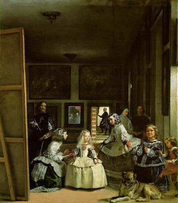
Assignment 3_Las Meninas

Retrieved August 20, 2011 from : http://www.oneonta.edu/faculty/farberas/arth/Images/110images/sl14_images/velazquez_lasmeninas_large.jpg
Las Meninas by Diego Velazquez

I have chosen this artwork for my assignment 3 is because I was curious about what the artwork is about. I would like to know more about the events about the artwork. Hence, I started my research on "Las Meninas" which is a masterpiece in Spain.
After researching on this artwork, I found that the artist had drawn himself in the artwork. He wanted to show the Spanish court that painting is an art too. He wanted to get respected and gain high social position.

Diego Velazquez was such a great artist. He used realism and illusionism in this artwork. I never thought that painting of a court can combine these two elements. But, he had used it in his painting.

_________________________________________________________

This is one of the part I did in my Assignment 3 :)


"Las Meninas" was recognized as a Baroque masterpiece in Spanish Golden Age. The artist challenge the concept of reality and illusion.

This artwork had fulfilling the criteria of functionalism. This artwork represented the artist's life at Spanish court. According to Madlyn Millner Kahr, she mentioned that the artist, Velazquez created something truly extraordinary and complex. She wrote that he had a greater intention when doing this artwork, which was to gain titile that ensure him a high place in the society. In 17th century Spain, painting was treated as craft and painters rarely enjoyed high social status. So, he wanted to prove the society that he could be an established painter. In the artwork, he used perspective, value, and colours to make the artwork outstanding. Moreover, he placed himself in the artwork to show that he deserves to be a member of royal family.

Besides that, the artwork had shown the artist's loyalty to the King Philips IV and Spanish court. The artist wanted to obtain recognition from the Spanish court. He was worked with the Spanish royal family for about thirty-three years since the age of 25. This had caused him to have the opportunity to paint the royal family in a furnished room in the palace.
Another criteria which was fulfilling by the artist was imitative. The artwork looked like a snapshot of the scene in a high ceilinged room in the Spanish palace. He had captured the Spanish court and painted it in a very close glimpse. The action in the artwork was frozen for eternity (Kahr). The artist portrayed the elevated presence of Royal such as Princess Margarita, King Philip IV, and Queen Mariana. Princess was physically present while the royal couple were shown in the reflection in the mirror and had God-like presence. (Foucault)

The artist had also used naturalism in the artwork. He illustrated the scenes of everyday life in the Spanish court. From the artwork, we can know that the princess was attended not only by ladies in waiting, but also dwarfs, chaperone, and so  on. This showed that the princess was in a protected world. Furthermore, we could know that the dwarfs were considered as "pets" of the princess. This is because the "little people" were often treated as amusement in the court. (Kahr)

Principles of Organisation in Arts & Design

Principles of Organization in Arts & Design by Salad Group
( I should have upload these mind map earlier, but I keep forget about this :P )

Balance

Unity

Variety

Repetition

Rhythm

Proportion

Scale


Space

Perspective

Saturday, 13 August 2011

Assignment 1_The Book of Dead

Retrieved from : http://www.ancient.eu.com/uploads/images/113.jpg

 Retrieved from : http://preterhuman.net/texts/other/crystalinks/egyptart5.gif

The Book of Dead

This is an artwork of an ancient Egyptian funerary text.
I have done some research on this artwork for my HoA&D1 Assignment 1.
 The Book of Dead is about the afterlife of a person.

I found it quite interesting.
This is because I never see artwork which related to afterlife although there are many artwork about religion.
 I wonder the artwork is similar to reality or more to imagination.
Still, it is interesting for me.

However, I'm not fully understand about this artwork.
Hope to do research again if got more time.
_____________________________________________________

The essay below is what I did for my HoA&D1 Assignment 1. My group members are Gim Khai Shian, Ma Vi Cienne, and Theresa Chong. I did the part II which is analysis of the artwork. But, I did not did a very good job for this part :(
 

In “Book of the Dead”, there are many principles of organization can be found. This had created visual impact of the artwork.

Firstly, the artist repeated 2 types of lines which were horizontal lines and vertical lines. Horizontal lines that appeared more at right hand side of the artwork created the state of peace in afterlife, while vertical lines that appeared more at left hand side created the sense of power of the God in afterlife. The combination of vertical lines and horizontal lines made the artwork balance.

Secondly, for the formation of shape, the artist used actual shape and implied shape. From the artwork, we can found that squares or rectangles were used and caused this artwork become serious and solid.
The artist used colour to create visual impact too. The use of both blue and orange, which are known as complementary colour had created contrast in this artwork. We can clearly identified the characters and object through contrast. Furthermore, analogous colour such as yellow-green, pure green and blue-green made the artwork peaceful and harmony. Hence, by using the principles of organization, the artist created unity in the “Book of the Dead” and we could feel completeness in this artwork.
The artwork was done on papyrus and sarcophagus by using scribed and written method. In the subjective view, this artwork made us feel scared because it involved death and afterlife. We would also feel scared feel the texture of wood when we touch it. Other than that, we might hear mysterical music and prayers. Taste of bitter chocolate could be tasted too.

Water Lily by Claude Monet

Photo source : Ms Clare (Powerpoint slides for Assignment 3)
Water Lilies

This is an artwork by Claude Monet, a French Impressionist.
I was attracted by his drawing is because he can draw water lilies in many different ways.
He drew his flower garden and he only focused on water lilies.

Retrieved from : http://upload.wikimedia.org/wikipedia/commons/thumb/a/a4/Claude_Monet_1899_Nadar_crop.jpg/200px-Claude_Monet_1899_Nadar_crop.jpg
Claude Monet

If I were him, I would not have the patient to do so many similar paintings.
He also used impressionism to do his paintings which was a great movement.

I like his drawing as I love to draw nature and flowers too :)

Thursday, 14 July 2011

Group Assignment in Lecture_Greek / Classical or Egyptian culture in M'sia

From Artlex Dictionary, classical is defined as the art of ancient Greece produced during the fifth and fourth centuries BCE. Later it included all works of art created from 600 BCE until the fall of Rome. Still later it was used to describe any art form thought to be inspired or influenced by ancient Greek or Roman examples.

Today, classical is used to describe perfection of form, with an emphasis on harmony and unity and restraint of emotion. Usually, it is applied to works that are representational but idealistic. Classic is used to describe anything which is the epitome of its type. 


Retrieved July 14, 2011 from : http://www.artlex.com/ArtLex/Ci.html 
_________________________________________________________

The photographs below are some examples of Greek/Classical or Egyptian culture in Malaysia which are found by the members of Group 9. 
1. Indian Jeweler


In the pictures above, we can found that the Corinthian Style is used in the design. This is because its capital is very elaborate and decorated with acanthus leaves. 
2. Municipal Council Building, Georgetown
Retrieved from : https://blogger.googleusercontent.com/img/b/R29vZ2xl/AVvXsEiseY-xCqG7Mhhr-P7_L1dyYiQ0mfQPezZXHBMkeS_XOdCfbGFvuYAaq0KIo_jIFIZ918b0l0gySgOGc2GqIyFgJk472QP-I-JZIc18U2A8pFT5izOAafhYyUKtTKve4Imn-JFrh24lEGs/s1600/015.jpg
Retrieved from : http://farm3.static.flickr.com/2161/5767940670_4c6a8da014.jpg

The elegent Municipal Council building in Georgetown built in 1879, the Town Council Offices (former Police Contingent building) in Klang built in 1910, and the Seremban State Library which was formerly known as the State Secretariat building built in 1912.

The architects used classically proportioned columns and plaster, using Doric, Ionian and Corinthian capitals, to create these majestic structures. These buildings embody the elegant colonial architectural design, with regal Corinthian columns, tall windows and spacious balconies on the upper floors.

Retrieved from : http://www.hbp.usm.my/conservation/British/britishcolonial1.htm
3. HSBC Bank, Ipoh
Retrieved from : http://v8.nonxt3.c.bigcache.googleapis.com/static.panoramio.com/photos/original/48332999.jpg?redirect_counter=1
The Hong Kong and Shanghai Bank (HSBC) building is another stunning white colonial structure and was actually the bank's first branch in Malaysia, being built when Ipoh was a fabulously rich city due to its tin mining operations
Retrieved from : http://www.ipoh.world-guides.com/ipoh_attractions.html
4. Old Railway Station, Kuala Lumpur
Retrieved from : https://blogger.googleusercontent.com/img/b/R29vZ2xl/AVvXsEipT06tBkCOpIKE3n3_R2jm7HK6JePvKH6UyoVREHusFOGrPQAdxw2tXQWaD4HE3F-3JJqBSTs2RF6Js4Ers6XWbChs4hOFWwTLWmr8M6nsxzAAL7iZKn-298TAT2Q8yZDwjnsQJCEaLBI/s1600/SL270343.JPG

It was designed by a British architect called A.B. Hubbock in the year 1913. The construction of the building was completed in the year 1917 after interruption by the First World War.

As Mr.Hubbock had previously served the British administration in India before being transferred to Kuala Lumpur, so he used Morish/Northern Indian designs here. Its domes and minarets’ unique features make it one of the most phothograph railway station in the world. The station housed a linear set of halls with the platforms were out behind. It has tall minarets and arches that are still in good condition today.

Retrieved from : http://www.malaysiavacationguide.com/kuala-lumpur-railway-station.html

5. Sultan Ibrahim Building 

(Main entrance)
Retrieved from https://blogger.googleusercontent.com/img/b/R29vZ2xl/AVvXsEgKUP1Ex9aCo6hvnfrWmiQ00Tvd_Ye_5nLEi2kZVqyLJYs4UoeG7jh25oaC4nwwP5sVkj4_pKd0y_mTMwooH6Tgdh-RogPIRMuwWi9nsCw_qUS94xBPUgLkApW7NUjjbP2gO0r23rzOzxI8/s1600/DSC03609.JPG
Retrieved from : http://www.skyscrapercity.com/showthread.php?t=383890&page=42


Sultan Ibrahim Building which located at Bukit Timbalan, Johor Bahru is the former state secretariat building of Johor.

The buiding's architecture have colonial and Malay architecture with its Saracenic design and tower made it a landmark in Johor Bahru. We can found Corinthian style at the entrance of this building.

_________________________________________________


In my opinion, the architecture of these buildings use the column nicely. 
I don't feel kitsch in these buildings.
However, there might be kitsch occurred in other building in Malaysia.

Greek Art_Architecture

 Greek Art

Greek Architecture  

Doric Style


- Rather sturdy and its top (the capital), is plain.
- Was used in mainland Greece and the colonies in southern Italy and Sicily.  

Example of Doric Style :

Parthenon


- Was built on the Acropolis in Athens, in the 5th century BC.
- Temple of Athena Parthenos ("Virgin"), Greek goddess of wisdom.

Ionic Style


- Is thinner and more elegant. Its capital is decorated with a scroll-like design.
- Was found in eastern Greece and the islands.

Example of Ionic Order :

Erechtheum


- Built on the Acropolis of Athens between 421 and 405BC.
- Temple from the middle classical period of Greek art and architecture.

 Corinthian Style


- Seldom used in the Greek world, but often seen on Roman temples.
- Its capital is very elaborate and decorated with acanthus leaves.

Example of Corinthian Order :

Temple of Zeus


-  Started in the 2d cent. B.C. and completed by Emperor Hadrian in the 2d cent. A.D.

Retrieved July 14, 2011  from : http://www.ancientgreece.com/s/Art/


Doing research on other countries art and culture is really time-consuming,  
but,  
this is quite interesting anyway. 
( If got time to do deeper research and understanding about the artworks )

Wednesday, 22 June 2011

Elements of Art & Design_Mindmap

Elements of Art & Design by Salad Group :)

Line

Shape

Texture

Colour

Colour

Colour

Colour

Colour

Colour

Value

Sunday, 19 June 2011

Why Graphic Design?

Graphic Design & Multimedia
is what I studying now

Actually
Graphic Design is not my 1st choice
I wanted to go for Fine Arts since I was in primary school
But,
When comes to decide what to do for my degree course,
I thought about many factors.

By having a Fine Arts cert,
Can I really survive in this realistic world?
By having a Fine Arts cert,
Can I support my family?

I heard that Fine Arts graduates encounter problems to get a job.

So,
I decided to choose UTAR which offer a more affordable fees,
To study Graphic Design & Multimedia.
I quite interested in Multimedia,
Although I not really good in dealing the software yet.

I do hope that I can learn something which I never know before.
Design is truly a big challenge for me,
As I always never have a new, unique idea,
And I also do not dare to try new stuff.

I need to change myself,
But I need time to change myself.

Will I change to become better in future?
I do hope so.


__________________________________


History of Art & Design
Is a bit difficult for me
Because I can't really remember about the history.
However,
I will try my best to learn it,
Since this subject is more interesting than the History we learn during the school time.
I think so.
:P

Sunday, 12 June 2011

Pyramids_Giza, China, Ur

This is what I found out about Great Pyramid of Giza, Qin Shi Huang Mausoleum, and the Great Ziggurat at Ur.


Retrieved June 12, 2011 from : http://good-wallpapers.com/pictures/4418/Great_Sphinx,%20Chephren%20Pyramid,%20Giza,%20Egypt.jpg

The most famous pyramids are the Egyptian pyramids — huge structures built of brick or stone, some of which are among the world's largest constructions. The Great Pyramid of Giza is the largest in Egypt and one of the largest in the world.


The Great Pyramid of Giza is one of the Seven Wonders of the Ancient World. It is the only one to survive into modern times. The Ancient Egyptians covered the faces of pyramids with polished white limestone, containing great quantities of fossilized seashells.


The pyramid has three burial chambers. The first is underground, carved into bedrock. The second, above-ground chamber was called the queen's chamber by early explorers. The third is the king's chamber, which held a red granite sarcophagus placed almost exactly at the center of the pyramid.

Retrieved June 12, 2011 from : http://en.wikipedia.org/wiki/Pyramid

I wonder how the people last time have the idea of making pyramid in triangle shape.
The structure inside the pyramid also make me curious.
However,
do I have the chance to see and even touch the pyramid?

________________________________________________________

Retrieved June 12, 2011 from : http://i.images.cdn.fotopedia.com/flickr-12138066-original/World_Heritage_Sites/Asia/East_Asia/China/Mausoleum_of_the_First_Qin_Emperor_Terracotta_Army/Terracotta_Army-original-14.jpg


The mausoleum of Qin Shi Huang is the largest preserved one in China. It is a unique architectural ensemble whose layout echoes the urban plan of the capital, Xianyang, with the Imperial Palace enclosed by the walls of the city, themselves encircled by other walls. The mausoleum is also associated with an event of universal significance: the first unification of the Chinese territory in a centralized state created by an absolute monarch, in 221 BC.

The first Emperor of China, Qin Shi Huang (Ying Zheng: 221-210 BC) arranged for his burial place long before his accession to the seat of supreme power. When he became king of Qin in 247 BC, Zheng had his geomancers choose a favourable site at the foot of Mount Li. Work was commenced and was carried out more energetically with each new political and military success over his rivals Han, Zhao, Wei, Chu, Yan and Qi. Following the proclamation of the Empire of Ten Thousand Generations in 221, work at the burial place took on extraordinary dimensions.

According to current estimates, the statue army of the Qin Shi Huang Mausoleum must have represented the exact number of the imperial guards. Over the past thirteen years, discoveries have revealed the dimensions of the mausoleum, and the site constitutes one of the most fabulous archaeological reserves in the world.

Because of their exceptional technical and artistic qualities, the terracotta warriors and horses and the funerary carts in bronze are major works in the history of Chinese sculpture prior to the reign of the Han dynasty. The army of statues also bears unique testimony to the military organization in China at the time of the Warring Kingdoms (475-221 BC) and that of the short-lived Empire of a Thousand Generations (221-210 BC).

Retrieved June 12, 2011 from : http://whc.unesco.org/en/list/441

Mausoleum is a great sculpture in China.
Although I have been knowing about "mausoleum",
but I never go into any research about it.
I did not even ask anything about it when I knew about the existence of mausoleum.
Even though now I have did some research on it,
I still not really understand the concept of mausoleum.
Maybe I should read the history of mausoleum in Chinese version since this sculpture is from China.
____________________________________________________


Retrieved June 12, 2011 from : http://userdisk.webry.biglobe.ne.jp/022/913/74/N000/000/000/130518993599816419033_Ancient_ziggurat_at_Ali_Air_Base_Iraq_2005.jpg

The Ziggurat at Ur, a massive stepped pyramid about 210 by 150 feet in size, is the most well-preserved monument from the remote age of the Sumerians. It consists of a series of successively smaller platforms which rose to a height of about 64 feet, and was constructed with a solid core of mud-brick covered by a thick skin of burnt-brick to protect it from the elements. Its corners are oriented to the compass points, and like the Parthenon, its walls slope slightly inwards, giving an impression of solidity.

The ziggurat was part of a temple complex that served as an administrative center for the city, and it was also thought to be the place on earth where the moon god Nanna, the patron deity of Ur, had chosen to dwell. Nanna was depicted as a wise and unfathomable old man with a flowing beard and four horns, and a single small shrine—the bedchamber of the god—was placed upon the ziggurat's summit. This was occupied each night by only one woman, chosen by the priests from among all the women of the city to be the god's companion. A kitchen, likely used to prepare food for the god, was located at the base of one of the ziggurat's side stairways.

Retrieved June 12, 2011 from : http://www.amazeingart.com/seven-wonders/ziggurat.html

Seriously,
I do not know anything about ziggurat.
Am I really an Art student?
:(
 __________________________________________________

Ai Wei Wei_Sunflower Seed

Retrieved June 12, 2011 from : http://www.tempi.it/sites/default/files/medium_110409-150945_To090411est_963.jpg


Ai Wei Wei is a well-known Chinese artist and activist, recently more because of his arrest as a part of the Chinese government’s crackdown. He is active in architecture, photography, film, curating, social and cultural criticism.

Retrieved June 12, 2011 from : http://en.wikipedia.org/wiki/Ai_Weiwei
_________________________________________________________________________________

I do not know this artist until I was asked to find out who is this artist in my History of Art & Design lecture class. I don't even know the story of Ai Wei Wei's arrest.


Retrieved June 12, 2011 from : http://se7enthirty.files.wordpress.com/2011/06/2ewx.jpeg

Retrieved June 12, 2011 from : http://arrestedmotion.com/wp-content/uploads/2010/10/img_2001.jpg


One prominent piece of his work was the Sunflower Seeds, an installations at the Tate Modern art gallery.

A sea of seemingly identical sunflower seeds, handcrafted by nearly 2,000 workers over a period of 2 years, it’s not just the scale of the piece that is impressive but its socio-political and historical scope that baffles. Each seed, each process and each hand that has gone to making these seeds has a meaning behind it and no detail has been left to chance. Each one was handcrafted by an artisan in one of the small-scale workshop, carefully selected by Wei Wei.

When I saw the articles about this artwork, I was surprised that the visitors are encouraged to touch, walk on, and interact with the seeds. This is because we are usually not allowed to touch the artworks in gallery. The use of seed in artwork has inspired me to be more creative in my artwork. I have to explore more to have more new, creative ideas.
__________________________________________________________________________________