Monday, 22 August 2011

Romanticism Artwork

Romanticism is not about love, romance or valentine, but it is about self creation.
I found that romanticism paintings are realism and emotionalism.

"The Romantic movement promoted 'creative intuition and imagination' as the basis of all art."
 Reference : http://www.visual-arts-cork.com/history-of-art/romanticism.htm

_________________________________________________

These are some romanticism paintings which I learned today.

Retrieved August 22, 2011 from : http://img1.ranker.com/list_img/1/158487/full/romanticism-art-and-artwork.jpg?version=1312545710000
Retrieved August 22, from : http://www.lib-art.com/imgpainting/9/2/10429-the-raft-of-the-medusa-theodore-gericault.jpg
Retrieved August 22, from : http://studio.pds.wikispaces.net/file/view/David_-_Napoleon_Crossing_the_Alps.jpg
Retrieved from : http://www.lilithgallery.com/arthistory/romanticism/franciscogoya-MayThird1808.jpg

Sunday, 21 August 2011

Rembrandt van Rijin

Last 2 weeks,
Dr Ray asked us to draw Rembrandt van Rijin.

The pictures above is the comparison of the original pictures and my sketching.

Retrieved from : http://www.rembrandtonline.org/Self-Portrait-with-a-Cap,-openmouthed.jpg
Drawn by / Photo source : Wong Wen Chee


I cannot do what the artist did for his self portrait.
He can draw very freely.
But I very rigid in my drawing sometimes.
I have been trying to change my way of drawing but it still the same.

Hope to have chance to try different ways of drawing and painting in future :)
______________________________________________

Retrieved from : http://www.ibiblio.org/wm/paint/auth/rembrandt/self/rembrandt.1640.jpg

Rembrandt Harmenszoon van Rijin was a Dutch painter and etcher in a period called Dutch Golden Age. He was a success portrait painter.

Retrieved from : http://en.wikipedia.org/wiki/Rembrandt

I wonder why the artist love portrait drawing so much.
He drew so much of self portrait,
which I myself can't do.
His drawing is unique and impressive.
Have to do more research on him to know him better :)

Saturday, 20 August 2011

Design of the Blog

For this blog,
I choose this template is because for me,
history is full of books and words.
So, I found that this template which have book shelf is suitable for History of Art & Design.


The theme of colour I chose green is because normally green symbolize nature.
I think that history happened naturally without people control much,
so I chose green as the theme colour of my blog.


Hope everyone enjoy my blog.
:)

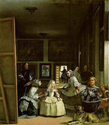
Assignment 3_Las Meninas

Retrieved August 20, 2011 from : http://www.oneonta.edu/faculty/farberas/arth/Images/110images/sl14_images/velazquez_lasmeninas_large.jpg
Las Meninas by Diego Velazquez

I have chosen this artwork for my assignment 3 is because I was curious about what the artwork is about. I would like to know more about the events about the artwork. Hence, I started my research on "Las Meninas" which is a masterpiece in Spain.
After researching on this artwork, I found that the artist had drawn himself in the artwork. He wanted to show the Spanish court that painting is an art too. He wanted to get respected and gain high social position.

Diego Velazquez was such a great artist. He used realism and illusionism in this artwork. I never thought that painting of a court can combine these two elements. But, he had used it in his painting.

_________________________________________________________

This is one of the part I did in my Assignment 3 :)


"Las Meninas" was recognized as a Baroque masterpiece in Spanish Golden Age. The artist challenge the concept of reality and illusion.

This artwork had fulfilling the criteria of functionalism. This artwork represented the artist's life at Spanish court. According to Madlyn Millner Kahr, she mentioned that the artist, Velazquez created something truly extraordinary and complex. She wrote that he had a greater intention when doing this artwork, which was to gain titile that ensure him a high place in the society. In 17th century Spain, painting was treated as craft and painters rarely enjoyed high social status. So, he wanted to prove the society that he could be an established painter. In the artwork, he used perspective, value, and colours to make the artwork outstanding. Moreover, he placed himself in the artwork to show that he deserves to be a member of royal family.

Besides that, the artwork had shown the artist's loyalty to the King Philips IV and Spanish court. The artist wanted to obtain recognition from the Spanish court. He was worked with the Spanish royal family for about thirty-three years since the age of 25. This had caused him to have the opportunity to paint the royal family in a furnished room in the palace.
Another criteria which was fulfilling by the artist was imitative. The artwork looked like a snapshot of the scene in a high ceilinged room in the Spanish palace. He had captured the Spanish court and painted it in a very close glimpse. The action in the artwork was frozen for eternity (Kahr). The artist portrayed the elevated presence of Royal such as Princess Margarita, King Philip IV, and Queen Mariana. Princess was physically present while the royal couple were shown in the reflection in the mirror and had God-like presence. (Foucault)

The artist had also used naturalism in the artwork. He illustrated the scenes of everyday life in the Spanish court. From the artwork, we can know that the princess was attended not only by ladies in waiting, but also dwarfs, chaperone, and so  on. This showed that the princess was in a protected world. Furthermore, we could know that the dwarfs were considered as "pets" of the princess. This is because the "little people" were often treated as amusement in the court. (Kahr)

Principles of Organisation in Arts & Design

Principles of Organization in Arts & Design by Salad Group
( I should have upload these mind map earlier, but I keep forget about this :P )

Balance

Unity

Variety

Repetition

Rhythm

Proportion

Scale


Space

Perspective

Saturday, 13 August 2011

Assignment 1_The Book of Dead

Retrieved from : http://www.ancient.eu.com/uploads/images/113.jpg

 Retrieved from : http://preterhuman.net/texts/other/crystalinks/egyptart5.gif

The Book of Dead

This is an artwork of an ancient Egyptian funerary text.
I have done some research on this artwork for my HoA&D1 Assignment 1.
 The Book of Dead is about the afterlife of a person.

I found it quite interesting.
This is because I never see artwork which related to afterlife although there are many artwork about religion.
 I wonder the artwork is similar to reality or more to imagination.
Still, it is interesting for me.

However, I'm not fully understand about this artwork.
Hope to do research again if got more time.
_____________________________________________________

The essay below is what I did for my HoA&D1 Assignment 1. My group members are Gim Khai Shian, Ma Vi Cienne, and Theresa Chong. I did the part II which is analysis of the artwork. But, I did not did a very good job for this part :(
 

In “Book of the Dead”, there are many principles of organization can be found. This had created visual impact of the artwork.

Firstly, the artist repeated 2 types of lines which were horizontal lines and vertical lines. Horizontal lines that appeared more at right hand side of the artwork created the state of peace in afterlife, while vertical lines that appeared more at left hand side created the sense of power of the God in afterlife. The combination of vertical lines and horizontal lines made the artwork balance.

Secondly, for the formation of shape, the artist used actual shape and implied shape. From the artwork, we can found that squares or rectangles were used and caused this artwork become serious and solid.
The artist used colour to create visual impact too. The use of both blue and orange, which are known as complementary colour had created contrast in this artwork. We can clearly identified the characters and object through contrast. Furthermore, analogous colour such as yellow-green, pure green and blue-green made the artwork peaceful and harmony. Hence, by using the principles of organization, the artist created unity in the “Book of the Dead” and we could feel completeness in this artwork.
The artwork was done on papyrus and sarcophagus by using scribed and written method. In the subjective view, this artwork made us feel scared because it involved death and afterlife. We would also feel scared feel the texture of wood when we touch it. Other than that, we might hear mysterical music and prayers. Taste of bitter chocolate could be tasted too.

Water Lily by Claude Monet

Photo source : Ms Clare (Powerpoint slides for Assignment 3)
Water Lilies

This is an artwork by Claude Monet, a French Impressionist.
I was attracted by his drawing is because he can draw water lilies in many different ways.
He drew his flower garden and he only focused on water lilies.

Retrieved from : http://upload.wikimedia.org/wikipedia/commons/thumb/a/a4/Claude_Monet_1899_Nadar_crop.jpg/200px-Claude_Monet_1899_Nadar_crop.jpg
Claude Monet

If I were him, I would not have the patient to do so many similar paintings.
He also used impressionism to do his paintings which was a great movement.

I like his drawing as I love to draw nature and flowers too :)